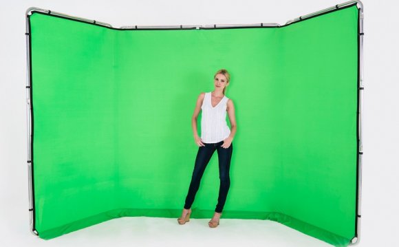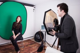
 Once only the realm of big-budget Hollywood productions such as ET, green screen (or chroma key) technology is now available to all. Want your spokesperson transported to a Parisian café or a mountain summit? You can easily mix two images together by shooting on these special screens, applying a mask in Photoshop and adding your background of choice. Any business or budding filmmaker can create amazing corporate videos or digital shorts. But how do you decide which color to use? It’s a snap once you master a few basics.
Why Green or Blue?
Most commonly called green screens, Hollywood originally used blue screens, or traveling matte, exclusively. Blue is the furthest color in the visual spectrum from red (which is the main color in human skin tones.) This special effect dates back to the 1940’s film The Thief of Bagdad (which went on to win an Oscar for this breakthrough effect). Fast-forward to the present and basically there are two major reasons for using either blue or green screens:
- Today’s cameras (in particular video cameras) have digital sensors highly sensitive to the color green.
- Human skin tones contain no blue or green, preventing any background interference. (Just make sure your model does not hail from the planet Pandora!)
When to Use Green Screens
Not only is color important when deciding which to use, luminescence also plays a factor. The green channel is the cleanest on digital cameras and therefore the sensors deliver less noise. Because of this, green screens are by far the most popular. Extremely versatile, green screens work great for indoor, outdoor or studio shoots. And, because of their brightness you’ll be able to get away with using fewer studio lights (thus saving time and money when shooting.) A non-reflective surface that creates a smooth, even backdrop such as the Tech Green Seamless Paper is a good choice for shooting in multiple locales. Three key points about green screens:
Spillover
The high-key factor of this color tends to create bleed onto the subject. Be sure to light your scene evenly. This eliminates shadows and will make the keying process easier in post-production. Avoid wrinkles in your photo backdrop as well as they will not key out properly.
 Wardrobe
Make sure your subjects are not wearing any green colored wardrobe or the background you mask in will appear on their clothes.
Subject to Background Distance
Be sure leave enough space between subject and backdrop or you may suffer from spillover as well.
Photo by Ryan Walsh
When to Use Blue Screens
Since blue screens are darker, they work best with low-light scenarios such as night scenes. Shooting at night means you’ll want to choose a screen such as Studio Blue Seamless Paper that’s easy to set-up and also reusable to help save on those costly night location shoots. Three key points about blue screens:
Less spillover because of its low-luminosity.
Color Corrections
Somewhat easier with blue screens (ex. blond hair easily turns reddish after removing green). Be wary however – the camera samples blue less than green. This means that when setting your key, there may be considerably more tweaks and adjustments for a smooth natural key.
Wardrobe
As with green screens, be careful not to include wardrobe the same color as your screen.
Lighting
The blue key will require almost a whole f-stop, or two times more light. If you are lighting a large scene, this could prove to be difficult.
Experiment
Practice in a variety of locations and vary the lighting, wardrobe and props to see what effects you achieve. Import your test shots into Photoshop and open Windows/Channel. Select either the blue or green channel only (depending on what screen color you've chosen). This will allow you to evaluate the luminance factor of any green or blue objects in your scene and determine if enough separation is achieved. Keep a notebook of each set-up you create for future reference.
YOU MIGHT ALSO LIKE


